
As you may have heard, Google is changing its algorithm again. It’s not to drive website owners crazy, I promise! It’s because Google wants its users to receive the most relevant and timely results from their searches, regardless of whether they’re on a mobile or a desktop device. With that in mind, Google will be placing more weight on mobile-friendliness as a ranking factor in mobile search results starting April 21st.
Not sure whether your site is mobile-friendly? Use this handy dandy testing tool to find out. If your test comes back ‘mobile-friendly’, WOOHOO! If your test comes back ‘Not mobile-friendly’, don’t panic just yet. You have options.
If your site is on WordPress:
• Option 1 Try the JetPack ‘Mobile Theme’ feature. You can’t customize it much, but it’s super quick and super easy to turn on.
• Option 2 Most WordPress sites can be made mobile-friendly with a plugin or two and about 2-4 hours’ work. I particularly like Graphene Mobile (no longer in development but still supported and only available through select web designers, like me).
• Option 3 You can select an online provider like Duda. They offer mobile-only solutions at for $9.99/mo (or $86.40/yr or get your mobile site for life for $159). If you click through that link, scroll down a bit to where it reads, “Need to make old websites mobile-friendly? Check out our mobile-only solution,” and you’ll see the pricing info. Customize to the max!
• Option 4 If your site is several years old and ready for a facelift anyway, you could invest in a complete redesign with a responsive theme.
If your site is not on WordPress:
• Option 1 Stay on your current platform and see option 3 above.
• Option 2 Redesign on the WordPress platform with a responsive theme.
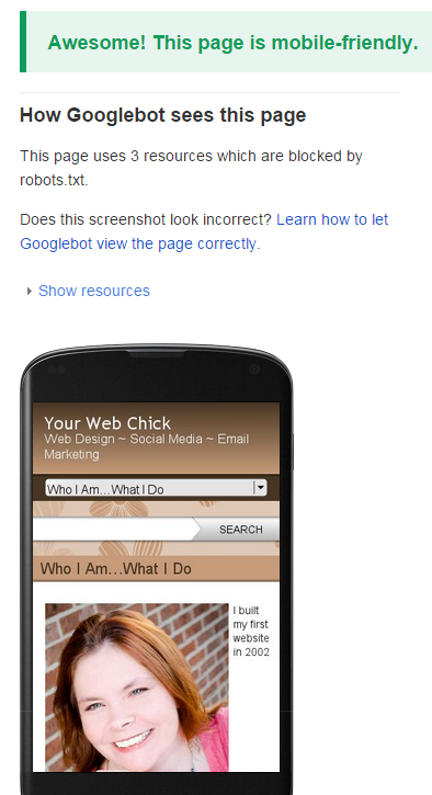
When I first heard the news about this change to the Google algorithm, I suspected my site was not mobile-friendly. Imagine that, a web designer! Classic case of ‘The Cobbler’s Children Have No Shoes’. Of course, the tool confirmed my suspicions, but two simple plug-ins and 90 minutes later – voila!
Disclaimer: There may be an affiliate link or two in the content above, but I would recommend every one of these tools with or without affiliate credit.
 I would love to hear how you made out with testing your site for mobile-friendliness and what steps you plan to take if the tool alerted you that your site was NOT mobile-friendly.
Please feel free to share in the comments below!
 Award-winning web professional Bonny Clayton, aka Your Web Chick, offers web design, support and maintenance for small business, with a specialty in WordPress.
A Tech Geek with a Creative Streak℠, she helps small business owners and entrepreneurs everywhere establish and maintain their online presence. She is committed to serving them according to their needs, whether that means “giving them a fish” or “teaching them to fish”.


1 comment
Our site was prepped to be mobile friendly via our web designer (cousin)…..we are NOT computer-literate, but when the news came out about it, she started working on it. Great web designers are a godsend! And once it was done, we’ve had no problems whatsoever, either on desktop or mobile.